
← Back to Home
← Back
← Back to Home
A UX case study focused on redesigning Meesho's post-return experience by addressing delayed pickups, refund uncertainty, and the lack of meaningful user guidance after a return is initiated.
A UX case study focused on redesigning Meesho's post-return experience by addressing delayed pickups, refund uncertainty, and the lack of meaningful user guidance after a return is initiated.
A UX case study focused on redesigning Meesho's post-return experience by addressing delayed pickups, refund uncertainty, and the lack of meaningful user guidance after a return is initiated.
Role
UX Research • UI Design
Role
UX Research • UI Design
Role
UX Research • UI Design
Timeline
4 Weeks
Timeline
4 Weeks
Timeline
4 Weeks
Platform
Mobile
Platform
Mobile
Platform
Mobile
Tools
Figma • Claude • Google Stitch • Perplexity
Tools
Figma • Claude • Google Stitch • Perplexity
Tools
Figma • Claude • Google Stitch • Perplexity

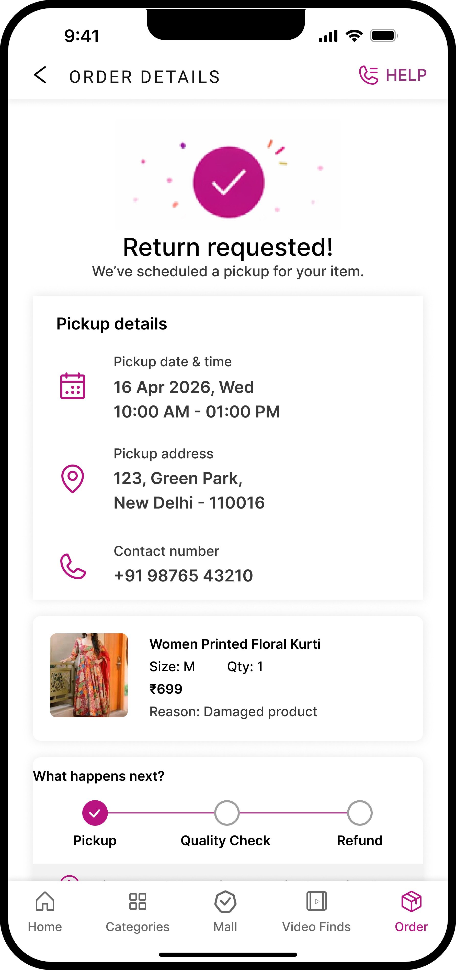


THE PROBLEM
THE PROBLEM
I started by using the Meesho app personally, going through the entire shopping and return flow as a real user. Then I read through dozens of recent App Store reviews. What I found wasn't random frustration. It was the same story, over and over.
I started by using the Meesho app personally, going through the entire shopping and return flow as a real user. Then I read through dozens of recent App Store reviews. What I found wasn't random frustration. It was the same story, over and over.
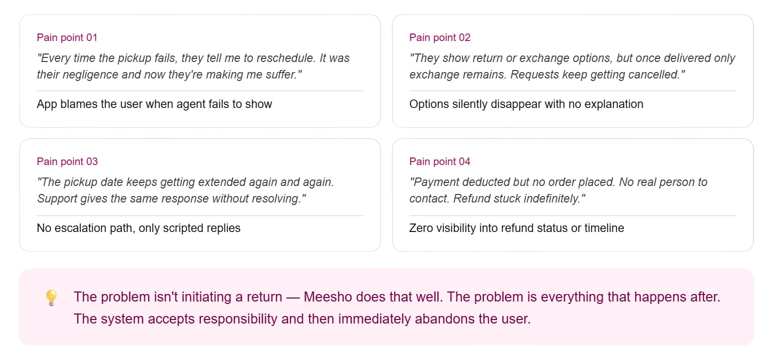
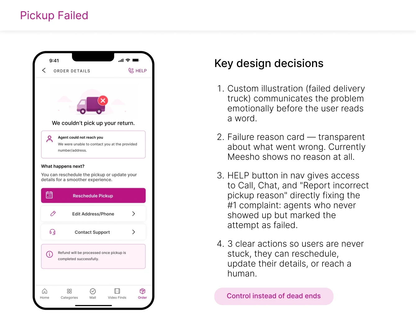
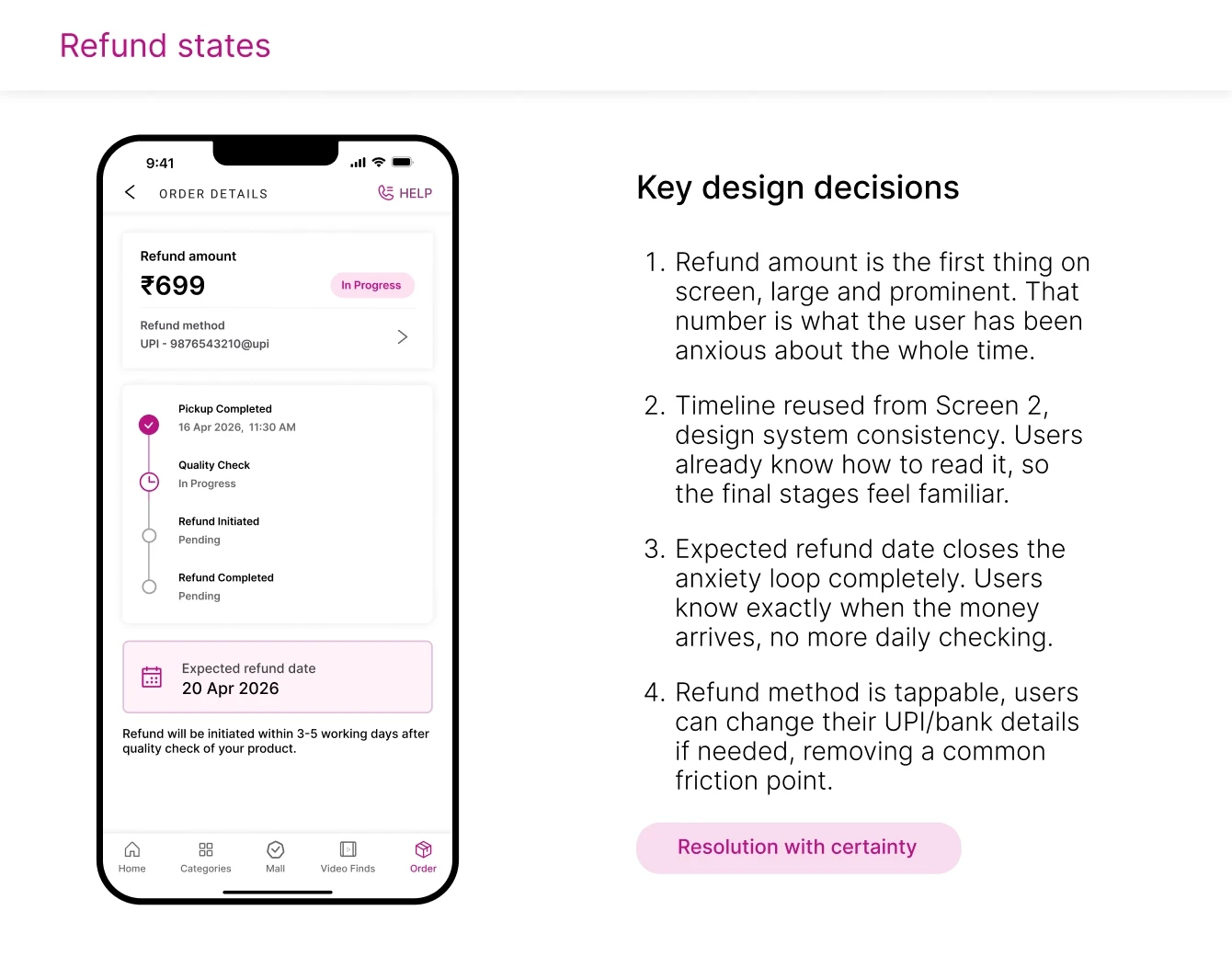
When a meesho return is accepted but pickup fails repeatedly, users have no visibility, no control and no real escalation path, leaving them stuck in a loop of empty promises with their money on hold.
When a meesho return is accepted but pickup fails repeatedly, users have no visibility, no control and no real escalation path, leaving them stuck in a loop of empty promises with their money on hold.
When a meesho return is accepted but pickup fails repeatedly, users have no visibility, no control and no real escalation path, leaving them stuck in a loop of empty promises with their money on hold.
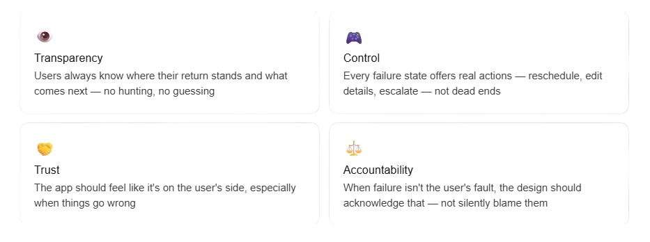
DESIGN GOALS
DESIGN GOALS
USER FLOWS
USER FLOWS
Rather than redesigning the whole app, I mapped the specific journey that breaks from return acceptance to refund credit and designed for every state along the way.
Rather than redesigning the whole app, I mapped the specific journey that breaks from return acceptance to refund credit and designed for every state along the way.

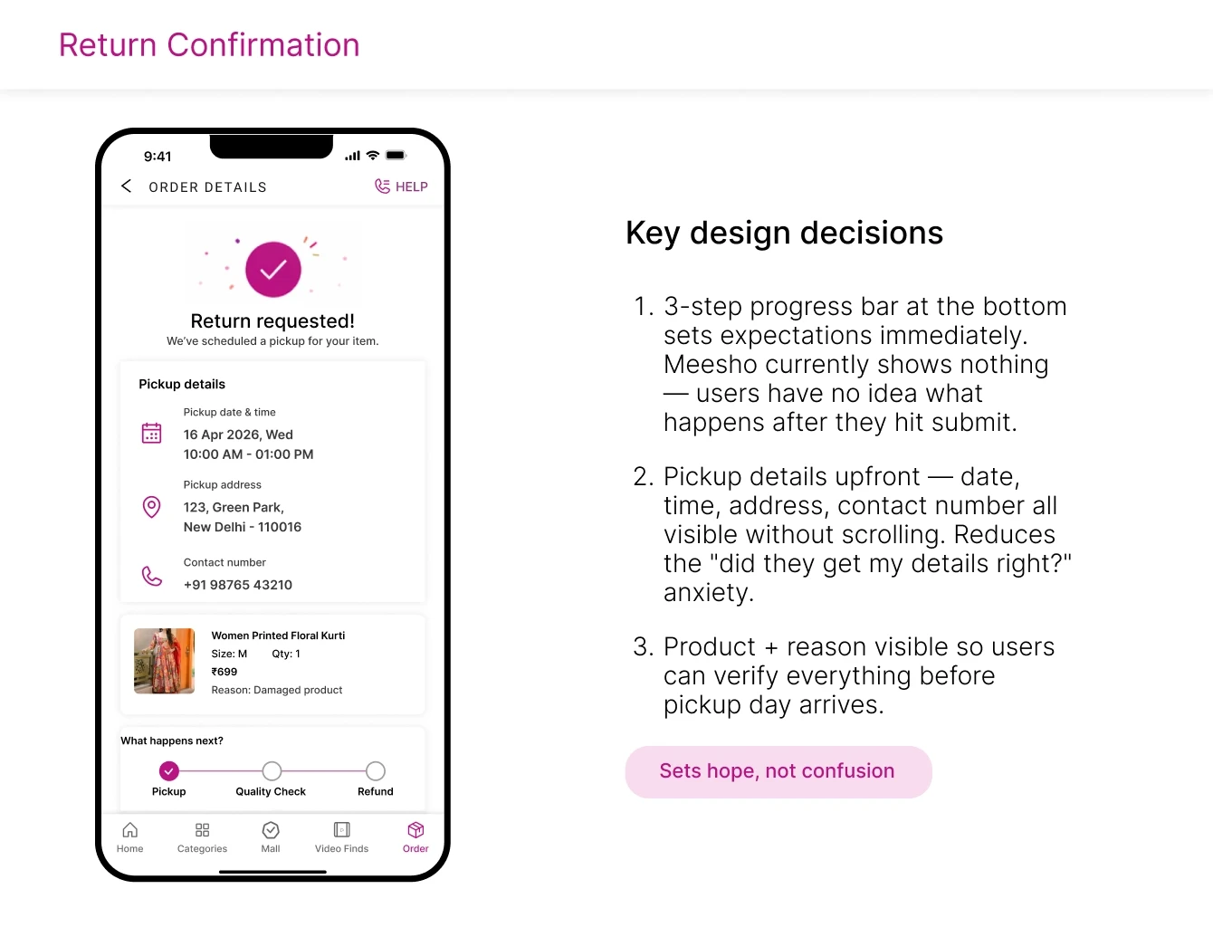
FINAL UI
FINAL UI


KEY TAKEAWAY
KEY TAKEAWAY
"The most impactful design work happens in the moments apps choose to ignore. The failure path gets a chatbot and a generic error. This redesign gives it transparency, control, and accountability — the three things users actually need when something goes wrong."
Designing for failure isn't pessimistic. It's how you build trust.
"The most impactful design work happens in the moments apps choose to ignore. The failure path gets a chatbot and a generic error. This redesign gives it transparency, control, and accountability — the three things users actually need when something goes wrong."
Designing for failure isn't pessimistic. It's how you build trust.
"The most impactful design work happens in the moments apps choose to ignore. The failure path gets a chatbot and a generic error. This redesign gives it transparency, control, and accountability — the three things users actually need when something goes wrong."
Designing for failure isn't pessimistic. It's how you build trust.
NEXT STEPS
NEXT STEPS
