AVEO SKINCARE
AVEO SKINCARE
AVEO SKINCARE
AVEO is a premium skincare concept built around a quiet, refined visual language and a tactile digital experience. I developed the brand identity and translated it into a responsive e-commerce website, shaping everything from the visual direction and product presentation to the interface, interactions, and overall digital experience.
What if skincare felt less clinical and more personal?
What if skincare felt less clinical and more personal?
What if skincare felt less clinical and more personal?
AVEO was imagined as a brand that sits between beauty and ritual, refined enough to feel premium, but warm enough to feel familiar.
AVEO was imagined as a brand that sits between beauty and ritual, refined enough to feel premium, but warm enough to feel familiar.
AVEO was imagined as a brand that sits between beauty and ritual, refined enough to feel premium, but warm enough to feel familiar.

Softness, with a point of view.
Softness, with a point of view.
Softness, with a point of view.
Instead of following the usual clean-white skincare aesthetic, AVEO combines warm neutrals, delicate typography, sculptural forms, and unexpected colour accents.
Instead of following the usual clean-white skincare aesthetic, AVEO combines warm neutrals, delicate typography, sculptural forms, and unexpected colour accents.
Instead of following the usual clean-white skincare aesthetic, AVEO combines warm neutrals, delicate typography, sculptural forms, and unexpected colour accents.
The result is a visual identity that feels calm without disappearing
The result is a visual identity that feels calm without disappearing
The result is a visual identity that feels calm without disappearing


The bottle became the starting point, not the finishing touch.
The bottle became the starting point, not the finishing touch.
The bottle became the starting point, not the finishing touch.
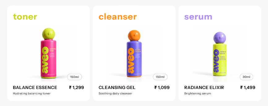
Each product was designed as part of one family — consistent in form and typography, but given its own colour, character, and place within the collection.
Each product was designed as part of one family — consistent in form and typography, but given its own colour, character, and place within the collection.
Each product was designed as part of one family — consistent in form and typography, but given its own colour, character, and place within the collection.

Five Products. One visual language.
Five Products. One visual language.
Five Products. One visual language.
Product cards keep the collection cohesive while giving each formula its own presence.
Product cards keep the collection cohesive while giving each formula its own presence.
Product cards keep the collection cohesive while giving each formula its own presence.
A skincare store that lets the products breathe.
A skincare store that lets the products breathe.
A skincare store that lets the products breathe.
The website was designed around a simple idea: make discovery effortless, then let the product take over.
The hierarchy moves naturally from brand → collection → product → decision.
The website was designed around a simple idea: make discovery effortless, then let the product take over.
The hierarchy moves naturally from brand → collection → product → decision.
The website was designed around a simple idea: make discovery effortless, then let the product take over.
The hierarchy moves naturally from brand → collection → product → decision.
Information without the overload.
Information without the overload.
Information without the overload.
The PDP keeps the product visible while gradually revealing details, benefits, ingredients, and purchase information exactly when they're needed.
The PDP keeps the product visible while gradually revealing details, benefits, ingredients, and purchase information exactly when they’re needed.
The PDP keeps the product visible while gradually revealing details, benefits, ingredients, and purchase information exactly when they’re needed.
Nothing moves just to move.
Nothing moves just to move.
Nothing moves just to move.
Subtle transitions, product movement, and interactions give AVEO a sense of touch and continuity without taking attention away from the skincare.
Subtle transitions, product movement, and interactions give AVEO a sense of touch and continuity without taking attention away from the skincare.
Subtle transitions, product movement, and interactions give AVEO a sense of touch and continuity without taking attention away from the skincare.
From bottle to browser.
From bottle to browser.
From bottle to browser.
AVEO became more than a skincare identity, it became a complete visual and digital system, connecting the product, packaging, interface, and interaction into one experience.
AVEO became more than a skincare identity, it became a complete visual and digital system, connecting the product, packaging, interface, and interaction into one experience.
AVEO became more than a skincare identity, it became a complete visual and digital system, connecting the product, packaging, interface, and interaction into one experience.
A softer ritual, from skin to screen.
A softer ritual, from skin to screen.
A softer ritual, from skin to screen.
got a project in mind?
got a project in mind?
got a project in mind?
let's talk tanishka.visuals@gmail.com
let’s talk tanishka.visuals@gmail.com
let’s talk tanishka.visuals@gmail.com