




PROJECT OVERVIEW
PROJECT OVERVIEW
PROJECT OVERVIEW
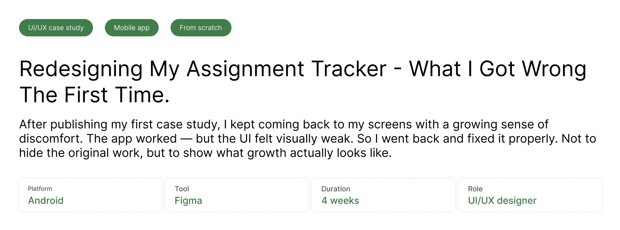
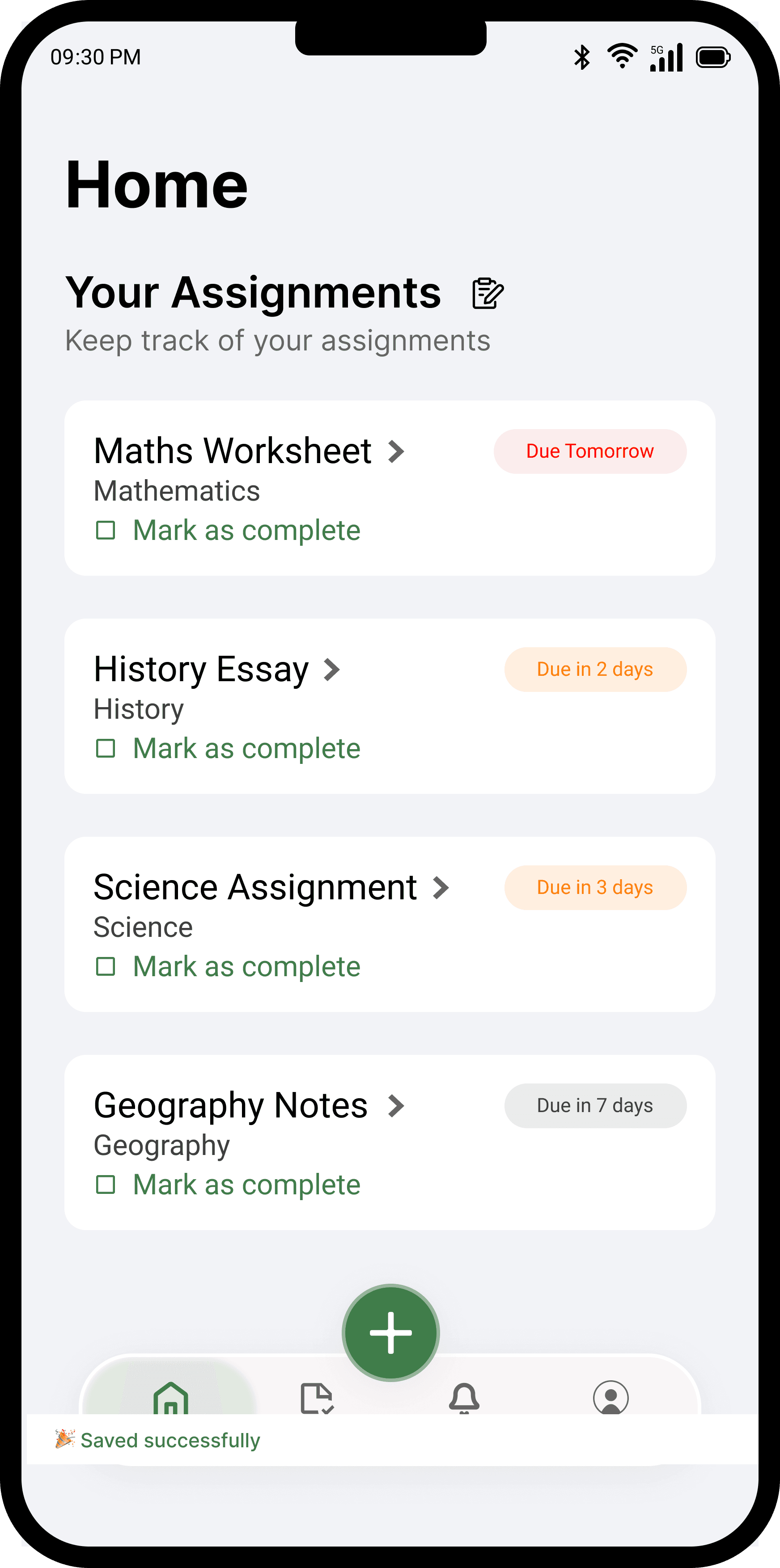
Students often struggle to keep track of multiple assignments and deadlines. This project explores a simple mobile interface that helps students add, track, and complete assignments easily.
Students often struggle to keep track of multiple assignments and deadlines. This project explores a simple mobile interface that helps students add, track, and complete assignments easily.
WHY I REDESIGNED THIS
WHY I REDESIGNED THIS
WHY I REDESIGNED THIS
The more I studied professional UI, explored design inspiration, and practised in Figma, the more specific my discomfort became. It wasn't just that the old design "looked off" I could now name exactly why.
The more I studied professional UI, explored design inspiration, and practised in Figma, the more specific my discomfort became. It wasn't just that the old design "looked off" I could now name exactly why.
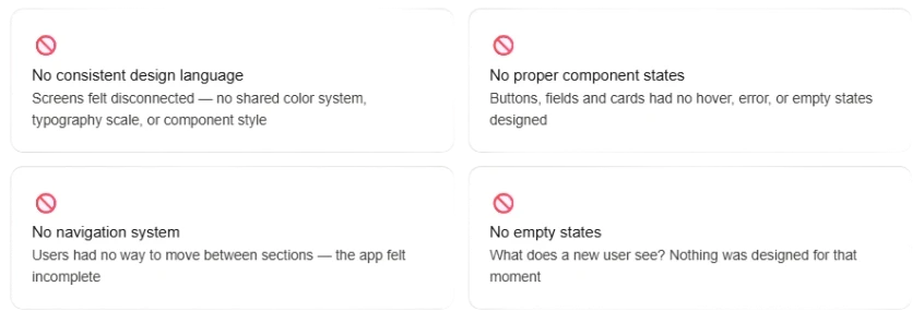
To validate this, I showed the original screens to 3 college students and asked them to interact naturally. Their responses confirmed everything.
To validate this, I showed the original screens to 3 college students and asked them to interact naturally. Their responses confirmed everything.

USER PERSONAS
USER PERSONAS
USER PERSONAS
Two personas were created based on conversations with college students. These guided every design decision throughout the redesign.
Two personas were created based on conversations with college students. These guided every design decision throughout the redesign.

DESIGN INSPIRATIONS
DESIGN INSPIRATIONS
DESIGN INSPIRATIONS
Before redesigning, I collected references from Mobbin to understand patterns used in professional apps — and filtered each one through the app's own identity before applying it.
Before redesigning, I collected references from Mobbin to understand patterns used in professional apps — and filtered each one through the app's own identity before applying it.

DESIGN SYSTEM
DESIGN SYSTEM
DESIGN SYSTEM
A small but intentional design system was established before touching any screens — covering color styles, typography, and core components. This is what made consistency possible across all screens.
A small but intentional design system was established before touching any screens — covering color styles, typography, and core components. This is what made consistency possible across all screens.

WHAT CHANGED AND WHY?
WHAT CHANGED AND WHY?
WHAT CHANGED AND WHY?


NEW SCREENS - COMPLETING THE EXPERIENCE
NEW SCREENS - COMPLETING THE EXPERIENCE
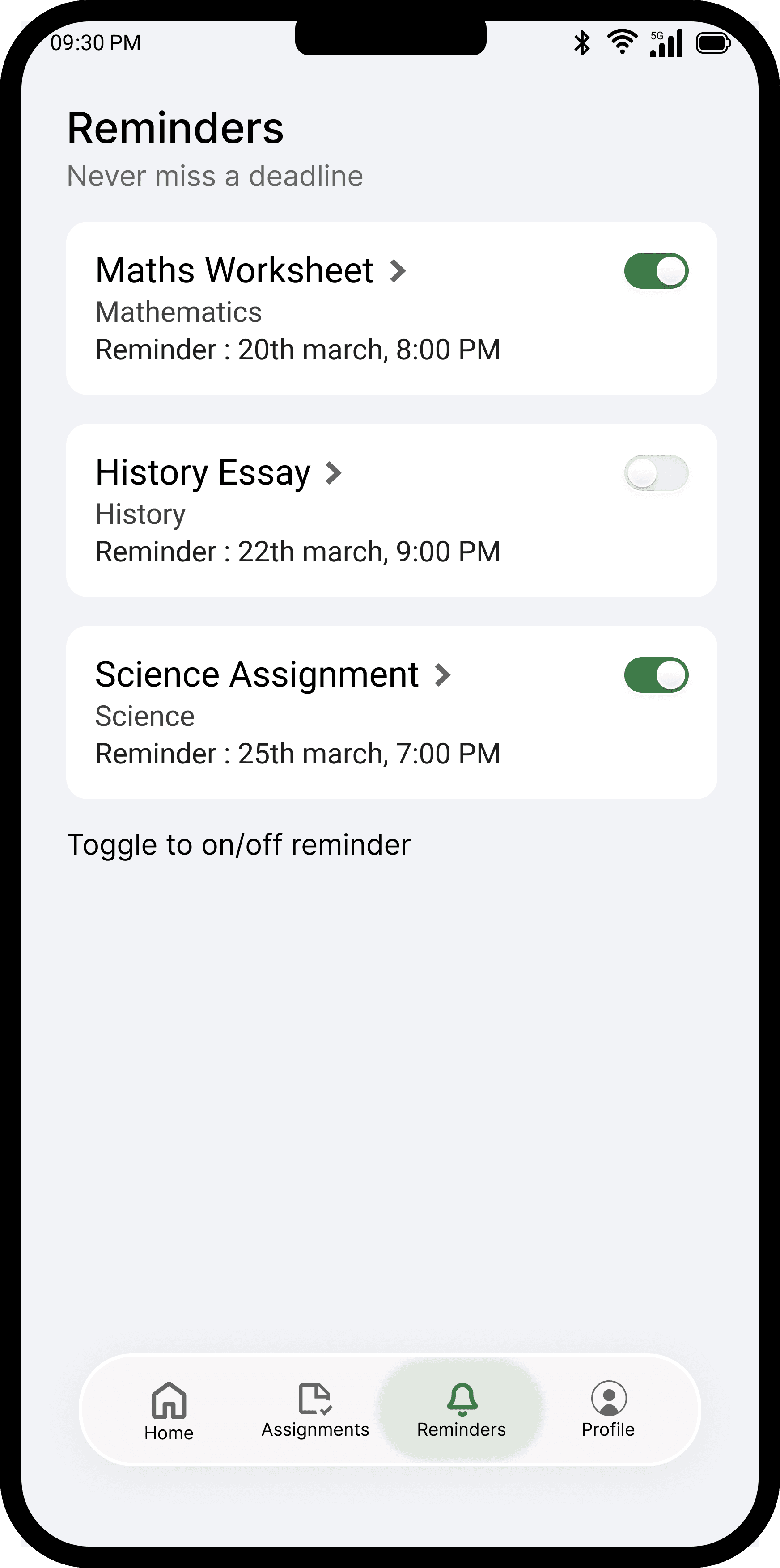
The original app had no reminders screen, no profile screen, and no empty states. Every nav bar item now has a screen. Every screen has an empty state. Every action has a response.
The original app had no reminders screen, no profile screen, and no empty states. Every nav bar item now has a screen. Every screen has an empty state. Every action has a response.

ITERATIONS
ITERATIONS
ITERATIONS
Before finalising, I explored multiple directions. The Add Assignment screen went through two field style variations — and the decision between them taught me something important.
Before finalising, I explored multiple directions. The Add Assignment screen went through two field style variations — and the decision between them taught me something important.


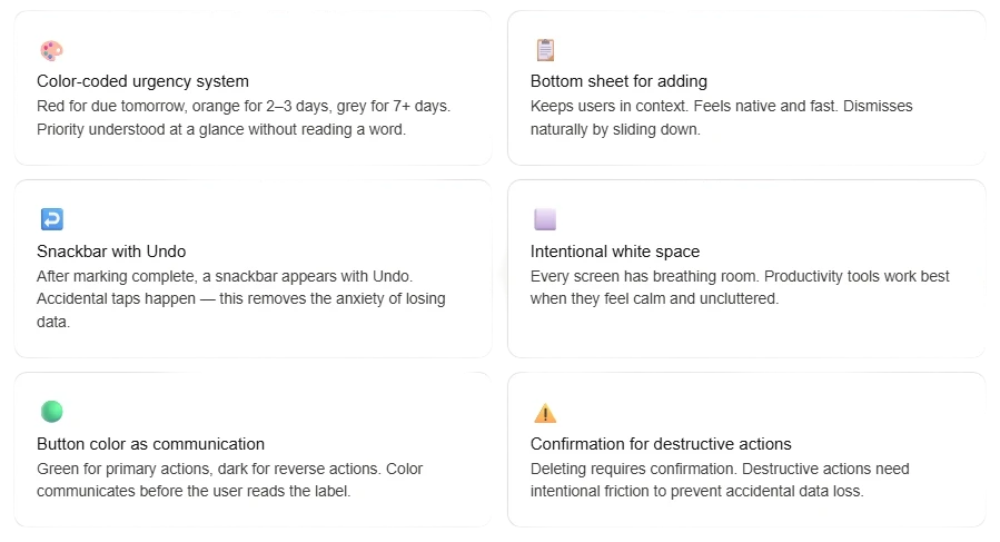
KEY DESIGN DECISIONS
KEY DESIGN DECISIONS
KEY DESIGN DECISIONS
ACCESSIBILITY CONSIDERATIONS
ACCESSIBILITY CONSIDERATIONS
ACCESSIBILITY CONSIDERATIONS

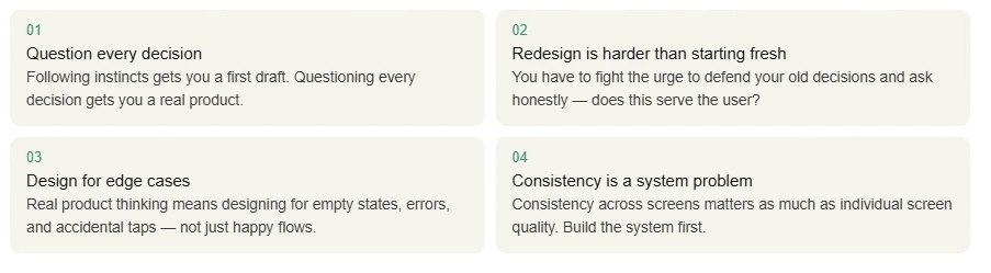
WHAT I LEARNED
WHAT I LEARNED
WHAT I LEARNED
SEE WHERE IT STARTED
SEE WHERE IT STARTED
SEE WHERE IT STARTED
Read case study of ''Assignment tracker app'' original from scratch
Read case study of ''Assignment tracker app'' original from scratch
Read case study of ''Assignment tracker app'' original from scratch